Use the form elements to create information and input interfaces for your form.
Function of the dialog elements
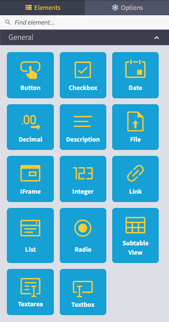
You can choose from the following form element types for modern forms:
Element type |
Explanation |
Details |
Properties |
Events |
|---|---|---|---|---|
Button |
The element represents a button. |
- Name - Label - Info text |
- Disable (j/n) - Hidden (y/n) |
- OnClick |
Checkbox |
Checkbox If you want to provide several checkboxes, these must be created as individual elements. |
- Name - Label - DB Field |
- Required (y/n) - Disabled (y/n) - Hidden (y/n) |
- OnChange - OnUnChecked |
Date |
This element offers the option of displaying or entering a date (e.g. via a calendar) |
- Name - Label - DB Field |
- Required (y/n) - Disabled (y/n) - Hidden (y/n) |
- OnChange |
Decimal |
Input field for displaying and entering decimal values. |
- Name - Label - DB Field - Placeholder |
- Required (y/n) - Disabled (y/n) - Hidden (y/n) |
- OnChange |
Description |
Inserts a freely definable text into the dialog. |
- Name - Label |
- Hidden (y/n) |
none |
File |
An element for attaching files is displayed in the dialog. |
- Name - Label - DB Field |
- Required (y/n) - Disabled (y/n) - Hidden (y/n) |
- OnChange |
IFrame |
Integrate Website
Please Note: The use of IFrames is at your own risk. JobRouter® assumes no liability for security risks, data protection violations or incompatibilities that may arise from the embedding of external content. Please check the source of the embedded content carefully. |
- Name - Hyperlink - Info text |
- Height in Pixels - Scrollbar (y/n) - Hidden (y/n) |
none |
Integer |
Input field for displaying and entering integer values. |
- Name - Label - DB Field - Placeholder |
- Required (y/n) - Disabled (y/n) - Hidden (y/n) - Minimum Value |
- OnChange |
Link |
A link to another Internet address is displayed in the dialog. |
- Name - Label - Hyperlink |
- Hidden (y/n) |
- OnClick |
List |
The element creates a selection list.
Please note: To configure a list as source, it must first be created. You can find out more about this in the chapter “Creating and editing a new list”. |
- Name - Label - DB Field |
- Required (y/n) - Disabled (y/n) - Hidden (y/n) |
- OnChange |
Radio |
Displays radio buttons based on a configured list.
Please note: To configure a list as source, it must first be created. You can find out more about this in the chapter “Creating and editing a new list”. |
- Name - Label - DB Field |
- Options per row (number) - Disabled (y/n) - Hidden (y/n) |
- OnChange |
Subtable View |
This element displays a sub-table view. In this view, data from a sub-table is displayed and can be changed there if necessary.
Please note: To link to a subtable view, it must first be created. You can find more information on this in the chapter “Creating a subtable view”. |
- Name - Label - Info text - Subtable view |
- Default Number of Rows - Disabled (y/n) - Hidden (y/n) |
none |
Textarea |
An input area for displaying and entering values is displayed in the dialog. |
- Name - Label - DB Field - Placeholder |
- Requiered (y/n) - Read-only (y/n) - Disabled (y/n) - Hidden (y/n) - Height (number of rows) - Minimum length (number of characters) - Maximum length (number of characters) |
- OnChange |
Textbox |
A standard input field for displaying and entering values is displayed in the dialog. |
- Name - Label - DB Field - Placeholder |
- Requiered (y/n) - Read-only (y/n) - Disabled (y/n) - Hidden (y/n) - Minimum length (number of characters) - Maximum length (number of characters) |
- OnChange |
Please note: The details, properties and events to be defined may differ depending on the form element and development status.
Handling form elements
Form elements can easily be dragged and dropped from the toolbox into the columns of your form. See also chapter “Inserting elements”.
Configuration
Clicking on a form element again in the workspace opens the Options tab in the toolbox.
Here you can enter further details, properties and events.
Please remember to confirm each desired change with the green Save button.
Moving form elements
If you hold down a form element with the left mouse button, you can move it to places where an orange line appears. Position your form element on the orange line and release the left mouse button.